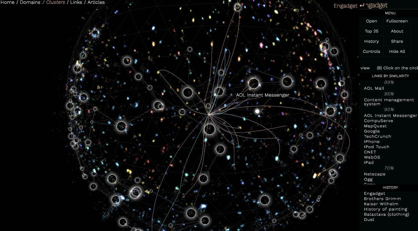
I’ve spent (too) many lazy evenings hopping from one Wikipedia entry to the next, reading things that could be useful for trivia night. It’s fun enough, but this website that visualizes Wiki as a universe could make the experience even better for a lot of people. You can zoom around to visit clusters of stars representing interconnected topics — clicking on one will load the article itself right within the interface. Since each star is visually connected to related entries with colored loopy lines, you can hop around like you would on the actual Wikipedia website.
Wikiverse is the upgraded version of an old Chrome experiment we covered back in 2014 called WikiGalaxy. It’s designed by French computer scientist Owen Cornec who wanted to find a way to display entries in “a more engaging way.” From what I can see, the new version is a lot more colorful compared to the older one. Cornec originally wanted to color code stars according to their super-categories, but he told us he wasn’t able to do so because there are too many super-categories to count. Instead, he decided to use colors to differentiate clusters from each other and to indicate whether an entry is within that cluster or in another one. Wikiverse also feels faster than its predecessor, even on browsers other than Chrome, so you’ll have zero issues pretending to be a spacecraft exploring a universe of knowledge.
[embedded content]


