The Uber app is a mess. As the company has expanded its business, it’s been ham-fisting new features into an already bursting-at-the-seams UI. Fortunately, the company is aware of the bloat and revealed today a redesigned app that will be rolling out to customers over the coming weeks.
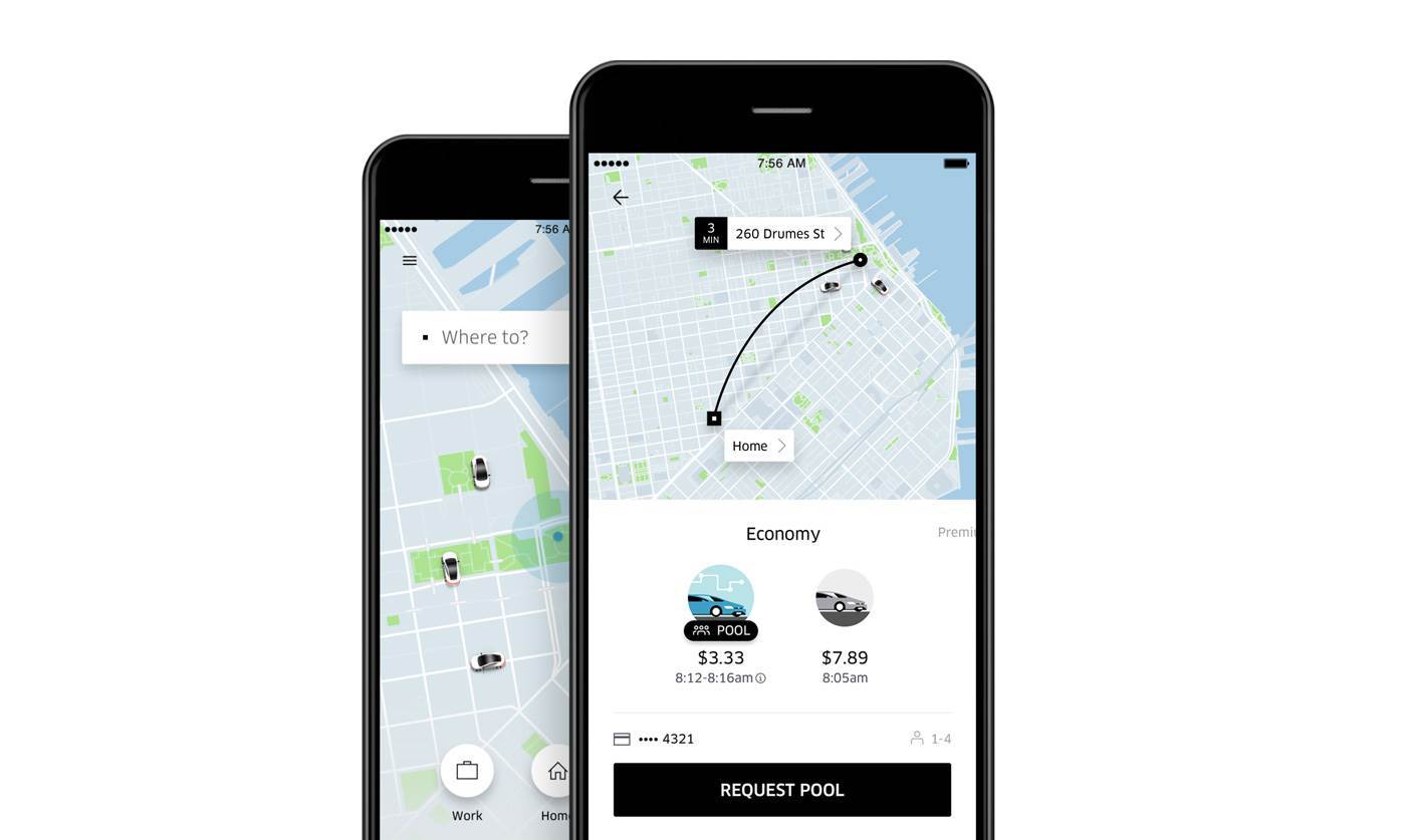
The new and improved Uber app doesn’t just make it easier to see how much a ride will cost or how long it will take (both are in there and are welcome additions). It’s also meant to keep Uber customers in the app long after they’ve hailed a car.

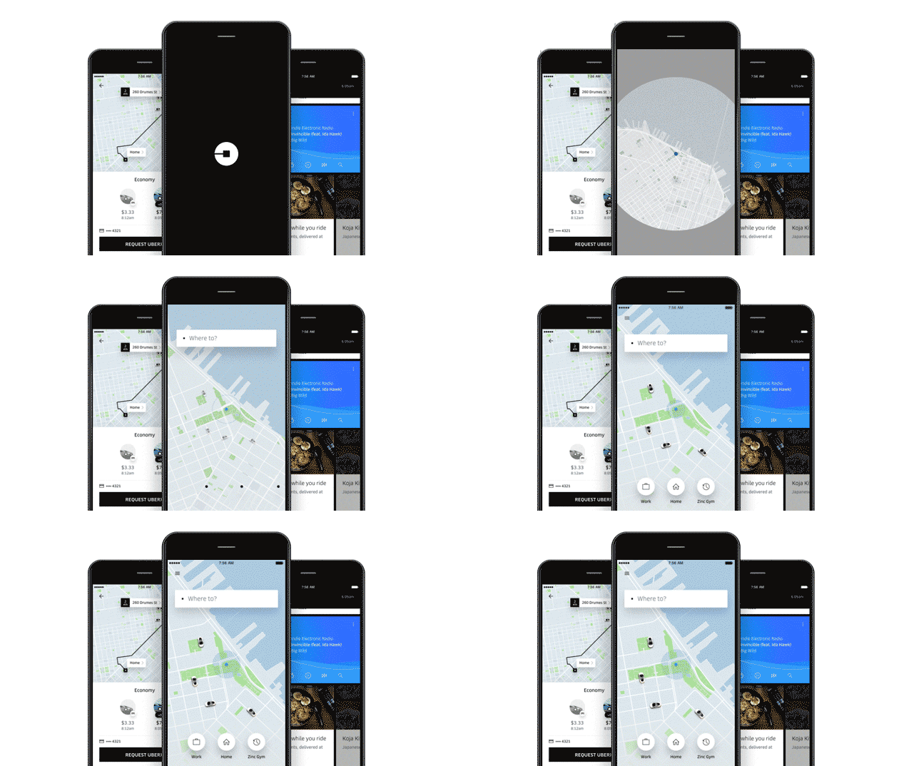
At the outset, the app launches noticeably faster. Actually, way faster. It then drops you right into the new, cleaner map design and asks, “Where to?” Gone are the plethora of on-screen ride-type options and tiny text. Instead, the app has a destination input field and three shortcut buttons for quick access to your home, work and next calendar appointment address.
Instead of all the ride types cluttering up the bottom of the app, they appear in pairs once you set a destination. Users can swipe left or right to find the kind of Uber experience you’d like, complete with a cost estimate and an ETA to your destination. The company believes that this will increase use of UberPool since riders will know up front approximately how long the shared ride will take.

The company notes the new design is meant to save you time. CEO Travis Kalanick says that unlike social media apps that are in the business of taking time away from you and selling it, the ride-hailing company wants to return what it sees as a user’s most valuable resource. “Uber has a maybe more unique business model. Our job is to give time back,” he said.
To give its riders more time (even though it’s a few seconds), the company has streamlined the entire process of catching a ride. But it even if you get the app today, it’ll be a few weeks before all the new features — like integration with the default calendar on your smartphone and using machine learning to determine where you might want to go based on your usual trips — are added.
Another feature that will take a little while to implement is the ability to sync your contacts to the app then set a person as a destination. The way it works is that if your friend also has the Uber app installed, you’ll be able to ask them to share their location within the app and if they agree to do so, it’ll be set as your destination.
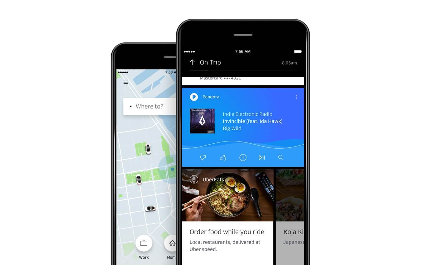
But what it will have at launch is a new section that Uber hopes will keep your attention in the app after you get in a car instead of opening Facebook and and Twitter. In addition to using Pandora to figuring out what song a driver is playing and potentially taking over the car’s stereo, riders will be able to order food via UberEats and see how long after they arrive at their destination their meal will show up.

The app will also surface Yelp reviews of your destination, or if you’re headed to a public transit stop the app will show when your train is departing and give you Foursquare tips. “I like to think of this a little like in-flight entertainment,” said said Yuhki Yamashita, senior product manager at Uber. “Where the airplane or car is on the map is a secondary in importance, instead we focus on getting more out of the ride.”
Uber will be pursuing more partnerships for its in-car entertainment in the future. But for now (actually, over the course of a few weeks), Uber is hoping to make the experience of using its app not just easier but more delightful and engaging. Surely it’s be better than those displays blaring ads in taxis.


