There are admirers, those who respect the work you do and draw inspiration from it, and admirers, those who not only respect your work but see how close they can come to replicating it. In the last few weeks, I’ve called to mind the Oukitel U15S that takes Samsung’s Scroll Capture and pushes the feature even further (letting you take one long screenshot up to 10 pages instead of 10 individual screenshots), and this is what we call inspiration. Samsung has tried its best to revolutionize the mobile experience and leave no stone unturned in doing so. Screenshots are one important area of that.
Well, respect for Samsung travels far and wide. Though Samsung has led the way in its smartphones in terms of everything from TouchWiz features to cameras to design, the Korean giant now leads the way in smartwatch design. The Gear S2 was the first circular smartwatch from Samsung that put away the square/rectangular form factor of previous smartwatches such as the Galaxy Gear, Gear 2, Gear 2 Neo, and the Gear S.
Regardless of your preference of smartwatch form factors, there’s no denying that the Gear S2 has its share of commendation and praise from the tech community. There are those who don’t agree with the majority view about the device (many make the case that the Gear S2 doesn’t have enough apps or that it isn’t a luxury watch), but award-winning products don’t always win over everyone.
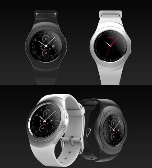
The latest respect and admiration comes from No.1, a Chinese manufacturer that has crafted a smartwatch I can only call the Gear S2′s identical twin. No.1 has named its Gear S2 clone the No.1 G3+.
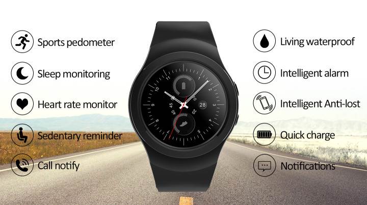
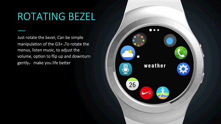
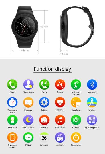
The No.1 G3+ has a 1.3-inch, IPS crystal sapphire screen with a screen resolution of 240 x 240p, and is made out of 316L stainless steel casing. The G3+ has a 380mAh battery, a MediaTek 2502 SoC, a rotating bezel it calls a rotary dial, sports pedometer, sleep monitor, heart rate monitor, sedentary reminder, intelligent alarm, intelligent anti-lost, quick charge, notifications, Bluetooth 4.0, remote music playback (from the phone), call support via Bluetooth, waterproofing (details unknown), and supports both Android and iOS. The G3+ comes in Light Silver and Deep Gun Black colors.
The G3+ appears to be the Gear S2′s identical twin, but mostly in looks. Sure, it has some features identical to the Gear S2, such as the 316L stainless steel casing, heart rate monitor, sleep monitor, sedentary reminder, Bluetooth, remote music playback, waterproofing (broad term here encompassing water resistance), and the white/silver and black colors. The white/silver and black colors were the same colors Samsung offered up for the Gear S2 when it was announced last year.
The rotating bezel, what No.1 calls the rotary dial, is the top feature of the Gear S2. It was a first back when Samsung announced it, and it is still a feature that I believe all smartwatch manufacturers should incorporate into their devices. No.1 has done that here, and should at least be commended for this decision. The Android and iOS support here should also be noted, with Samsung having recently opened up iPhone compatibility for the smartwatch. There are two buttons on the right side of the G3+, placed in the same layout as Samsung’s Gear S2.
There are some specs that do not match up with the Gear S2: the IPS display of the G3+ versus the AMOLED screen of the Gear S2, the 240 x 240p screen resolution of the G3+ versus the 360 x 360 screen resolution of the Gear S2, the 1.3-inch screen size of the G3+ versus the 1.2-inch screen size of the Gear S2, the 380mAh battery of the G3+ versus the 250mAh battery of the Gear S2 (though numbers don’t tell all the story), the MediaTek 2502 SoC of the G3+ versus Samsung’s use of its own Exynos 3250/Qualcomm Snapdragon 400 SoC in the Gear S2, among other things. The Gear S2 has IP68 water and dust resistance, and the G3+ has some water resistance (though its IP rating isn’t specified).
And then, there’s the fact that the G3+ operates by Bluetooth (OS unknown), while the Gear S2 runs Tizen, Samsung’s own battery-efficient wearables platform. The G3+ has some matching specs the Gear S3 such as screen real estate and battery life but appears to be the identical twin of the Gear S2. Perhaps we’d do well to think of it as a Samsung Gear S2/S3 hybrid clone. No.1′s short video comparison between the G3, the G3+’s predecessor, and Samsung’s Gear S2 isn’t coincidental, either, and the G3+ follows in the same vein.
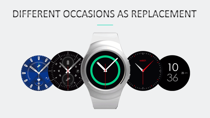
While the hardware draws heavy inspiration from Samsung’s Gear S2, some of the app icons also take cues from Samsung’s own. Samsung’s S-Health app icon and the G3+’s Motion app icon are too identical to be coincidental. Additionally, the G3+’s watch faces bear striking resemblance to Samsung’s own watch faces for its Gear S2 – leading me to think that coincidence is not at play here. There are other apps such as the calendar, phone dialer, and voice command that match Samsung’s design so much that, from afar, you’d mistake this for the Gear S2 if you didn’t read the spec sheet.
What can we take from this? Samsung’s Gear S2 is a smartwatch that has become noticed worldwide and has earned its own accolades. And now, other companies are taking notice. When your smartwatch design is this heavily studied by other companies, you know you’ve done something right.

![[Design Story] One UI Helps You Live Life Your Way – Samsung](https://loginby.com/itnews/wp-content/uploads/2025/11/1763476351_Design-Story-One-UI-Helps-You-Live-Life-Your-Way-238x178.jpg)


