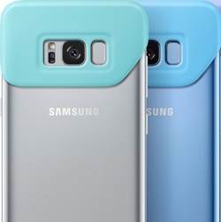
I abide by a personal “ugly scale”, which goes from 1 to “iPhone Smart Battery Case – Charcoal Gray.” You know which one I’m clamoring about – the one that makes the sleek and elegant iPhone look like it’s got a parasitic twin growing on its back. But now that I’ve seen Samsung’s new 2Piece Cover for the Galaxy S8 and S8+, I think it’s time for an upgrade. It’s pictured above, in all its disgusting glory.
No, forgive me about the last bit. Black is, indeed, an incredibly complimentary hue to… Black?! I asked Batman – he silently nodded and went on to drop-kick some bad guys. Strange fella, that Mr. Wayne.
This case killed my vibe.
Actually, the only remarkable geometry shown here is the Galaxy S8’s, whose lanky back is left exposed and vulnerable to every mishap you’ll ever have during your 24-month installment plan. The rest is a wicked mess! Apple’s case has looks that would have stupefied the late Steve Jobs, but at least it has symmetry. Samsung’s has nothing – it’s two pieces (2Piece!) of cheap material awkwardly tacked onto the $750 pinnacle of mobile technology. Heck, it would look stupid on a $50 Amazon Fire tablet!
Thankfully, the rest of Samsung’s new line of accessories is okay-ish. Here, look at this battery pack! It’s got a fabric hanger on it, so you can swirl it around your index finger or hang it in your closet, where the skeleton of Samsung’s design sense rests for eternity…


