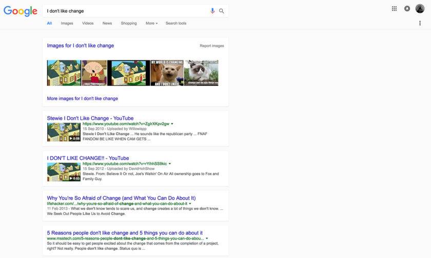
Some Google users have reported seeing signs that the company is testing a new, Material Design-based look for its desktop Search pages.
Introduced last year with the launch of Android 5.0 Lollipop, Material Design (MD) is Google’s “visual language” for melding classic design principles with adaptability that can accommodate new technological innovations. It’s designed to enable Google to provide a unified experience for users across platforms and devices.
Online mentions about signs of Material Design testing have been appearing over the past week on sites like Twitter and Reddit. A report by Engadget earlier today noted that the tests appear to be taking place on a small scale, apparently providing random Google users with a subtly different look on search results pages.
“We’re always experimenting with the look and feel of our products but have nothing to announce at this time,” a Google spokesperson told us today.
Growing Signs of MD Across Google Properties
Google first unveiled its Material Design concept at its 2014 I/O developer conference, saying the approach was designed to provide more context to content, especially on mobile devices.
In its latest update to Material Design specifications last month, Google introduced new guidelines to enable developers to deliver improved experiences of motion, greater accessibility for all users and “expansion panel” containers for lightweight editing of elements and tool creation.
YouTube, which is owned by Google, also recently showed signs of experimenting with a Material Design-influenced look, and Google’s April update to its Chrome operating system featured a Material Design revision of its core user interface.
“A year in the making, the MD redesign of Chrome consists in a complete revamp of how we implement the Core UI,” Google designer Sebastien Gabriel wrote on the Dribbble design community site in April. “Beyond a flatter, sharper and lighter design, it is a huge engineering feat.”
New Look for Twitter on Android
The changes recently spotted on Google search results aren’t “monumental,” Engadget noted today. While the “basic layout is functionally identical to the current one,” search pages with the Material Design update show results in white, slightly shadowed boxes on top of a light gray background. Some search terms also return results with an inline card showing additional details about the term in question.
Twitter yesterday also announced the launch of a redesigned app for Android users that incorporates elements of Material Design. The changes are designed to make using the app easier, Twitter said in a blog post.
Changes to the Twitter app include the addition of a tab bar at the top of a user’s screen with swipe functionality for nagivating to the Home timeline, Notifications, Direct Messages and other areas. A side slideout navigation menu also adds quick access to a user’s profile, lists, settings and other features.
Google has made a number of updates to its Material Design specifications since first launching the concept, and the company has noted that its description of the language is “a living document” that will continue being revised over time.


![[Interview] How Jacob Kiplimo’s Galaxy Watch Turns Data Into](https://loginby.com/itnews/wp-content/uploads/2026/04/1776021792_Interview-How-Jacob-Kiplimo’s-Galaxy-Watch-Turns-Data-Into-100x75.jpg)

