We set out to review Pixel, “Google’s first device,” which is one of the world’s most sought after devices. After 24 hours, we reached a number of conclusions.
Up until a month ago, we regarded the Nexus devices as “Google’s smartphones.” Since then, however, Google has unveiled Pixel, its new smartphone and the first to bear the “made by Google” brand. Google has taken its involvement in the device’s design and specs a step forward, and has turned HTC, in recent years a manufacturing partner like LG, Motorola, or Huawei, into its assembly line. Its relations with Google are now like the relationship between Apple and Foxconn. This is not the only similarity between Google and Apple, or between the Pixel and the iPhone, by the way.
We are reviewing the device, but before the review is ready, here are our impressions after the 24 hours we spent with it.
Hands on with Google Pixel
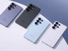
The design of the back of the devices is unique. There is no nice way to say it; the device’s back is odd, or more to the point, it looks weird.
Two thirds of the back is made of metal, and one third includes a glass coating. Maybe it stands out less in black, but to me, the lack of symmetry and the odd division, which is supposed to provide the device with better reception, seems peculiar. When you add the greatly increased fragility factor and the potential for scratching… it’s not for me.
Other than that, the device feels just like the iPhone, and of course that’s a compliment.
For the first time, Google has developed a special launcher for its device that is unavailable for other Android devices, including Nexus. So what’s different about it?
First of all, Google got rid of the icon that opened the apps drawer. In order to access all of your apps, you just make an upward sweep motion. This gives you room for another app next to the camera and dial icons.
Another change is in the upper part of the screen. Instead of the Google bar taking up the entire width of the screen, there is a small G button with a microphone, with the date on the other side. Still another change is the operating icons, which have been filled, and are no longer hollow. The icons are now round.
Force Touch
Apple has the Force Touch feature, which brings up a special operations menu when you press harder on the screen. Pixel’s launcher has a similar feature that works extremely well. Just press the app icon, but instead of releasing it, keep your finger on it a few more hundredths of a second, and presto, a high-speed operations menu for the app opens. For example, more sustained pressure on the Google Play Music app opens a menu with rapid access to the music library, or to the “I’m Feeling Lucky” button.
Google Assistant
Google’s Pixel device brings its Assistant to center stage. When we say “puts,” we mean virtually “forces it.” In order to get to it, just put sustained pressure on the round icon at the bottom of the screen, and everything switches to voice. The Assistant’s understanding and decoding of verbal instructions are absolutely sensational. One of the most impressive things about it is its use of context.
When we asked it, “When was Donald Trump born?”, we got his birth date. Then we asked, “Where was he born?”, and got an accurate answer, without repeating the name. The Assistant understood the word “he,” and realized that we were referring to the same person.
Another improvement that we didn’t like as much was the Chatbot interface, which will remind you of the chat in apps like WhatsApp. Note, however, that in contrast to Siri, it supports only English. When we selected “Israel” as the location, the Assistant did not appear at all; it only appeared when we switched to “USA.”
In the comprehensive review, we will obviously test the camera under different photography conditions. One of the more intriguing features in the new Pixel, however, is its video stabilizer. At first, we were disappointed that Google had not included an OIS optical stabilizer. Instead, Google used an EIS software stabilizer based on the camera gyro in the Pixel to correct for shaking. The short test we did compared mobile photography with Pixel to the Nexus P6, and the result is as you see.
We were impressed, but it is important to examine this feature over time and under different conditions.
The camera app is very fast, even when the HDR+ mode is turned on.
Google has presented a new feature that enables you to slide your finger over the device’s fingerprint reader, thereby dispensing with the notification bar, like the feature presented six months ago by Huawei in its P9 device. From our short trial with it, however, the app is slow and inadequate. More than once, we had to repeat the gesture several times before the device deigned to remove the alerts curtain. Furthermore, Huawei included the feature in all its apps, so that you could also use the fingerprint reader to perform actions like scroll between pictures in a gallery. As of now, Google is limiting the feature to alerts.
© 2016 Geektime under contract with NewsEdge. -.


