Another year, another Galaxy S flagship. With leaks flowing in faster than water from a tap, a lot was known about the Galaxy S8 ahead of its unveiling. Big design changes have been made this year: The front of the Galaxy S8 and Galaxy S8+ is a giant screen with very little bezel, with Samsung managing to fit 5.8-inch and 6.2-inch displays in bodies similar in size to devices that would usually feature much smaller screens.
Smaller batteries are also part of the equation once again, two years after the Galaxy S6 and Galaxy S6 edge, and the Galaxy Note 7 fiasco might be partly to blame. Samsung has to get back in the saddle this year after all the negative press for the Note 7, so a lot is riding on the Galaxy S8 and Galaxy S8+.
Has Samsung managed to succeed in making the S8 and S8+ good enough to make everyone forget about its “explosive” last flagship? Let’s dive into the review to find out.
Design
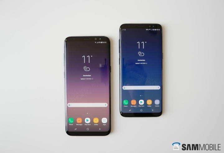
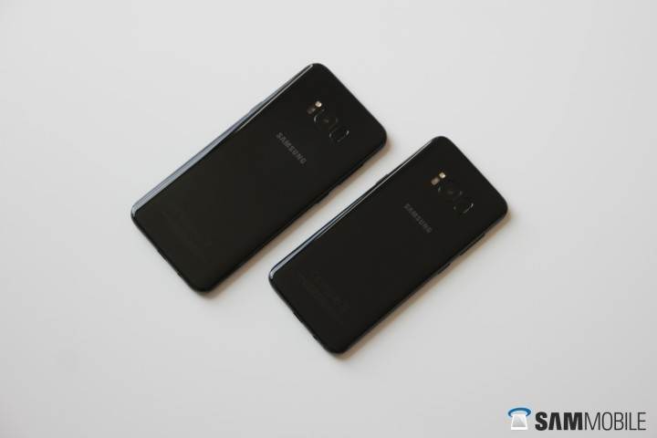
The Galaxy S8 and Galaxy S8+ are gorgeous phones. There are shortcomings, but let’s talk about the positives first. Samsung has dropped its traditional hard home button this year, allowing it to make room for those giant and beautiful displays. The S8 has a 5.8-inch display while the S8+ has a 6.2-inch display. The screen takes up almost the entire front side of the device, with just two small bezels at the top and bottom. This is still the same glass and metal IP68 certified design, but with Gorilla Glass 5 on the front and back. The sides are still curved (on both the front and back), although the curves are noticeably less pronounced than they were on the Galaxy S7 edge and flow more seamlessly into the metal sides.
The Galaxy S8 and Galaxy S8+ are gorgeous phones.
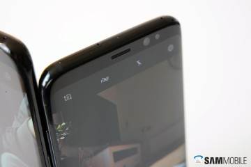
For the first time (at least on a global scale), the front of a Galaxy smartphone has no Samsung logo. Since every color variant of the Galaxy S8 is black at the front, it is, therefore, hard to see where the top and bottom bezels begin or end. It’s beautiful to look at, and the main reason why the Galaxy S8 and Galaxy S8+ look gorgeous from the front no matter what color variant you might purchase. The black top bezels also hide the array of sensors that are located there, including the earpiece and the new 8-megapixel front-facing camera.
On the right side of the device, there’s the power button as usual, but on the left side, the volume buttons are joined by a dedicated button for Bixby, Samsung’s new virtual assistant. The placement of the Bixby button isn’t great, as I unwillingly pressed the Bixby key instead of the volume keys. The Bixby button isn’t textured to make it stand out from the other buttons, so you can expect to be hitting it fairly often while trying to adjust the volume.
Because every color variant of the Galaxy S8 is black at the front, it is, therefore, hard to see where the top and bottom bezels begin or end.
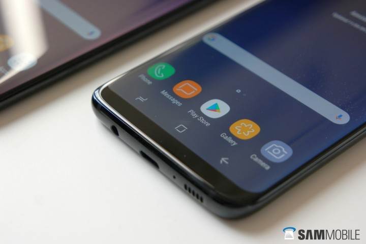
At the bottom of the phone, the microUSB port has finally given way to a USB Type-C port on a Galaxy S device, accompanied by the loudspeaker and the 3.5 mm headphone jack. People with OCD or the need to see perfection in design will be put off by the Type-C port, as it’s not exactly placed right in the middle. At the top resides the SIM and microSD slot (256GB cards are supported). Our review unit was a single SIM version, but some markets will be getting a dual SIM variant that will either work as a dual SIM device or let you use a single SIM card and a microSD card. Thankfully, the 64GB of internal storage means this might not be an issue anymore, as those wanting to use two SIM cards won’t necessarily be left wanting for storage space.
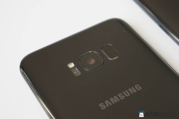
Now, let’s talk about the negatives. We all know where that fingerprint sensor, which used to reside on the home button, has been moved to. It’s been placed on the right side of the camera, where the heart rate sensor and LED flash used to be (these are now on the left). Since the phones have become a lot taller (a necessary move in order to make those giant screens more ergonomic), the fingerprint sensor is hard to reach, even with my gigantic hands. Reaching for the fingerprint sensor is certainly possible with a little adjustment of the phone in your hand, but that also results in smudges on the camera (unless you’re a left-handed user, in which case the fingerprint sensor becomes less of a problem). Samsung knows, and warns users to keep the camera lens clean. It’s clear this was a hurried design decision, and the one who made the decision should probably be kept away from design and usability-related tasks in the future.
Since the phones have become a lot taller, the fingerprint sensor is hard to reach.
The overall design of the Galaxy S8 and S8+ is narrow and tall. If you ask me, the smaller version is a little too narrow, while the bigger version is virtually as wide as the Galaxy S7 edge, which hits the sweet spot. Of course, opinions will vary on this, and the size of your hands is what will ultimately decide what phone is right for you. A note about the weight of these handsets. The S8 is lighter than the S7 edge, which makes it easy to use with one hand. But the S8+ ire a real heavyweight at 172 grams, so it will require both hands for comfortable usage.
Display
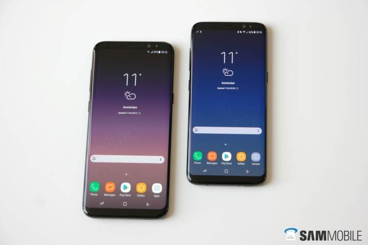
Samsung’s phones have always had the best displays, and this year the displays are taking center stage. Both models feature curved displays this year, with the S8’s sized at 5.8-inch and the S8+’ at 6.2-inch. Both feature a resolution of 2960×1440 (QHD+), although by default the phones run on Full HD+ resolution. Infinity Display is what Samsung has dubbed these Super AMOLED displays, which fits as the front of the phones basically looks like it’s all screen. These tall displays also have an odd new aspect ratio of 18:5:9, which allow for an enhanced multimedia experience according to Samsung.
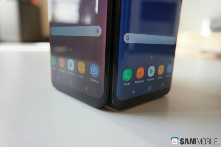
But the thing is, a lot of multimedia apps don’t support this aspect ratio, so you need to crop things out, which makes some things cut off. It defeats the purpose if you ask me. But the new aspect ratio does show its worth while browsing, as the extra content that can be seen on-screen can be very handy. Regular apps should also see better compatibility in the future, as Google is already telling developers how their apps should adjust to the new aspect ratio, which is also used by LG on the new LG G6.
As is usual with Samsung’s displays, the ones on the S8 and S8+ are stunning…
As is usual with Samsung’s displays, the ones on the S8 and S8+ are stunning, with great viewing angles and contrast (experts gave the displays an A+ rating). It’s on the cooler side with the default Adaptive mode, but Samsung continues to offer an option to change screen modes for those looking for something more natural. In bright sunlight, these displays can get insanely bright, which is also why they have official certification for HDR content. In the night, brightness can go really low to reduce strain, and the built-in blue light filter further ensures using your phone in bed won’t disrupt your sleep too much.
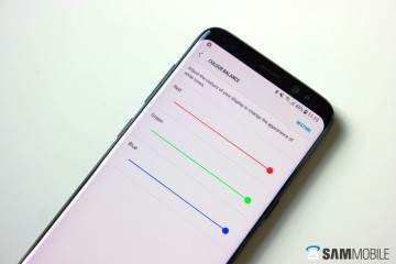
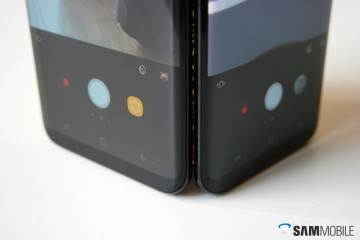
As you might have noticed in the pictures, Samsung’s tuning for the displays seems to be too red on one of our units. It’s apparently a production issue, and should you have this problem on your S8, you should call in for a replacement. Also, a little tip: Go into Settings » Display » Full Apps to enable the apps you want to run in fullscreen. Not all apps are set to run in fullscreen mode, so unless you turn it on, you will see black bars at the top and bottom on unsupported apps.
Camera
The Galaxy S8 and S8+ have a 12-megapixel rear camera with F1.7 aperture and Dual Pixel autofocus system, like the Galaxy S7 and S7 edge. Samsung has used a new sensor, though, and the S8 and S8+ employ a multi-frame processor that takes data from multiple pictures (or frames) and uses that data in the final image for increased quality over last year’s flagships. The camera app is the same as the one found on Nougat on the S7 and other devices and is now launched with a double press of the power button. It works on gestures: swipe up or down to switch between rear and front camera, swipe right to change modes, and swipe left to access filters and effects.

Speaking of filters, there are new additions in the form of masks. Think of them as the dog faces and other filters from Snapchat, now built into the camera. They work great, and you can download additional ones; the camera app even keeps the last used mask on the viewfinder for quicker access. Pro mode makes a return, with features like shutter speed control and shooting in RAW present, and the new floating camera button is also on-board. The only drawback with the camera app, as with last year’s phones, is that it shoots at 4:3 aspect ratio at the full resolution. For 18:5:9 pictures (that is, to use the entire screen), you have to dial the resolution down to 7.9 megapixels.
Now, about image quality. Whether because of that multi-frame processor or because of improved software processing (or both), the S8 and S8+ take pictures with more popping colors and better contrast than what the S7 and S7 edge managed. Photos taken in good lighting are sometimes too saturated and not close to the real thing, but the final images tend to be colorful and pleasant to look at.
The S8 and S8+ take pictures with more popping colors and better contrast than what the S7 and S7 edge managed.
At night, details in the blacks and dark areas can sometimes be lost, and colors are once again not very natural. But overall detail in low-light shots is amazing. Where the S7 and S7 edge would get a little blurry in low-light conditions, the S8 manages to capture a fair bit of detail with little to no noise.
As for the lack of a dual camera, I’m not sure it’s a big deal, if only because Samsung seems to have made improvements to macro photography. There’s increased depth of…

