Back in May at its I/O developer conference, Google introduced a pair of new communication apps: Allo for text-based communication and Duo for video calling. Allo is the more interesting of the two, with its deep usage of the intelligent Google Assistant bot — but Duo is the one we’ll get to try first. Google hopes it’ll stand out among a bevy of other communications apps thanks to a laser focus on providing a high-quality mobile experience. It’s available today for both the iPhone and Android phones.
“The genesis of Duo was we really saw a gap when it came to video calling,” Nick Fox, Google VP of communications products, said. “We heard lots of [user] frustration, which led to lack of use — but we also heard a lot of desire and interest as well.” That frustration came in the form of wondering who among your contacts you could have video calls with, wondering whether it would work over the wireless connection you had available and wondering if you needed to be calling people with the same type of phone or OS as yours.
[embedded content]
To battle that, Google made Duo cross-platform and dead simple to use. You can only call one person at a time, and there’s barely any UI or features to speak of. But from a technology standpoint, it’s meant to work for anyone with a smartphone. “It shouldn’t just work on high-end devices,” said Fox. “It should work on high-end devices and on $50 Android phones in India.”
Google designed it to work across a variety of network connections as well. The app is built to provide HD video when on good networks and to gracefully and seamless adjust quality if things get worse. You can even drop down to a 2G connection and have video pause but have the audio continue. “We’re always prioritizing audio to make sure that you don’t drop communications entirely,” Fox said.
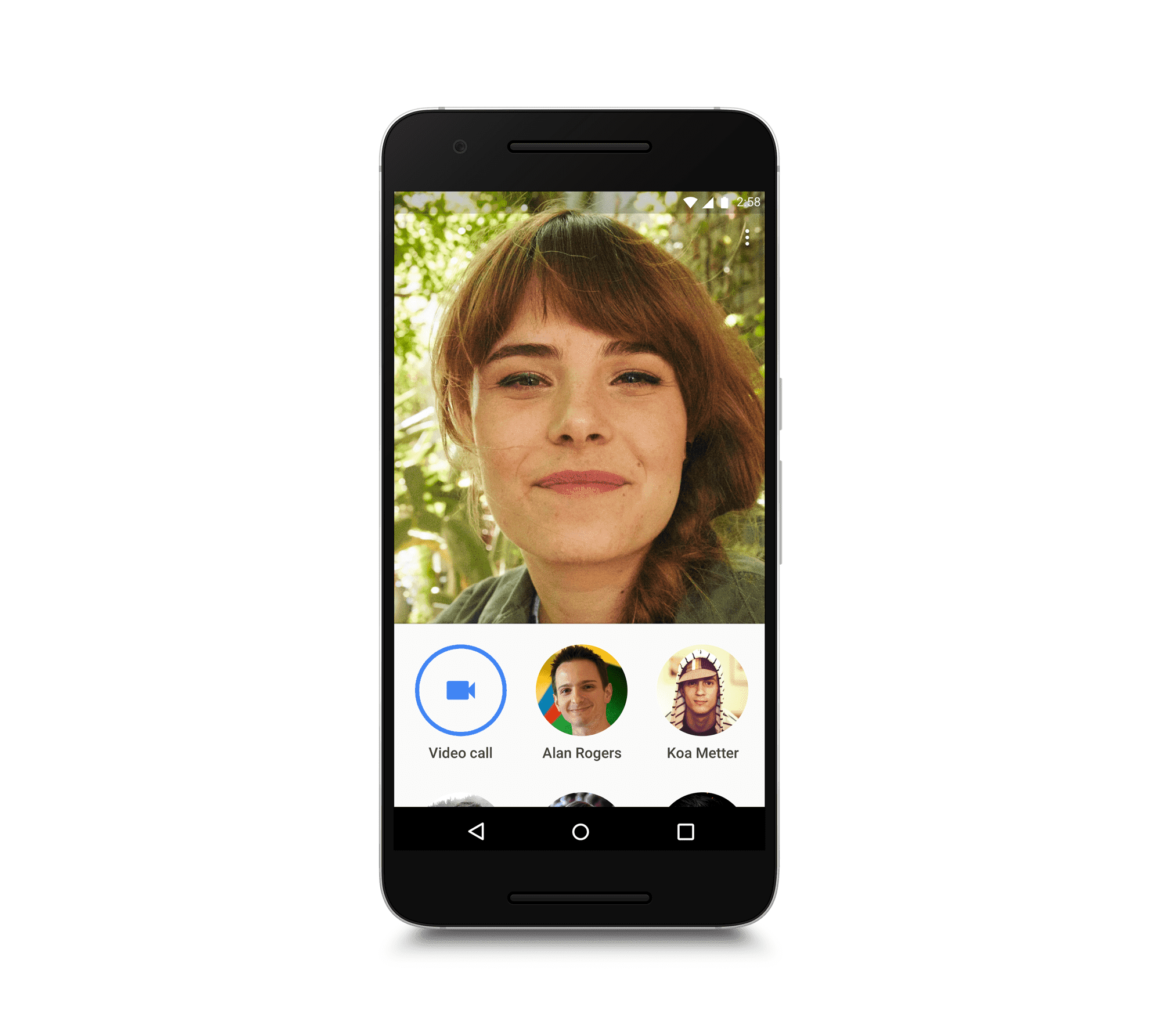
All of this is meant to work in the background, leaving the user with a clutter-free UI and basically no buttons or settings to mess with. Once you sign into the Duo app with your phone number (no Google login needed here), you’ll see what your front-facing camera sees. Below that are a handful of circles representing your most recent calls in the lower third of the screen. You can drag that icon list up and scroll through through your full list of contacts; if people in your phonebook don’t have the app, you can tap their number to send an SMS and invite them to Duo.
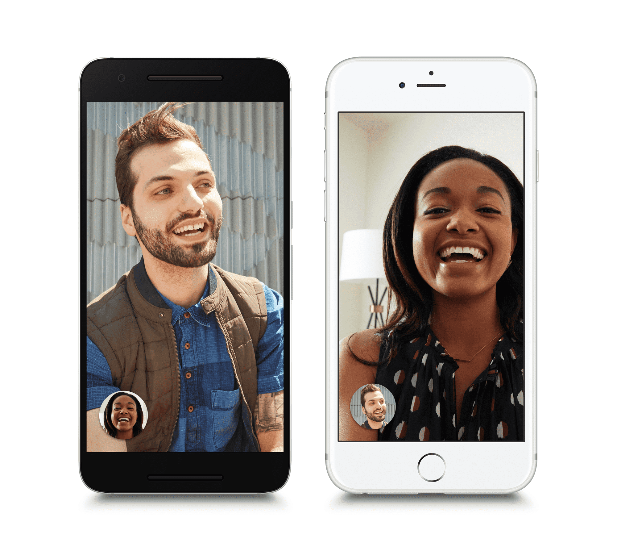
For those who do have Duo, tapping their number initiates a video call. Once you’re on the call, you just see the person you’re talking to, with your video feed in a small circle, not unlike Apple’s FaceTime. Tapping the screen reveals the only UI elements: a hang-up button, mute button and a way to flip between the front and back cameras.

Duo is even simpler than FaceTime, and far simpler than Google’s own Hangouts app, which the company says will now be more focused on business and enterprise users. In that focus on simplicity, Fox and his team left out a number of features you might find in other video-calling apps. Chief among them is that Duo can’t do group calls; it’s meant only for one-to-one calling. Google also decided against making desktop apps for Duo or Allo.
“We forced ourselves to think exclusively about the phone and design for the phone,” Fox says. “The desktop experience is something we may build over time. But if you look around the world at the billions of people that are connected to the internet, the vast majority have one device, and that device is a phone. So it was critical for us to really nail that use case.”
That’s part of the reason Google is tying Duo to a phone number rather than your Google account: Your phone already has your contacts built in, while many people might not curate or manage their Google contacts list. This way, you can see exactly who in your usual phone book is using Duo (and if they’re not, you can send them an SMS invite).

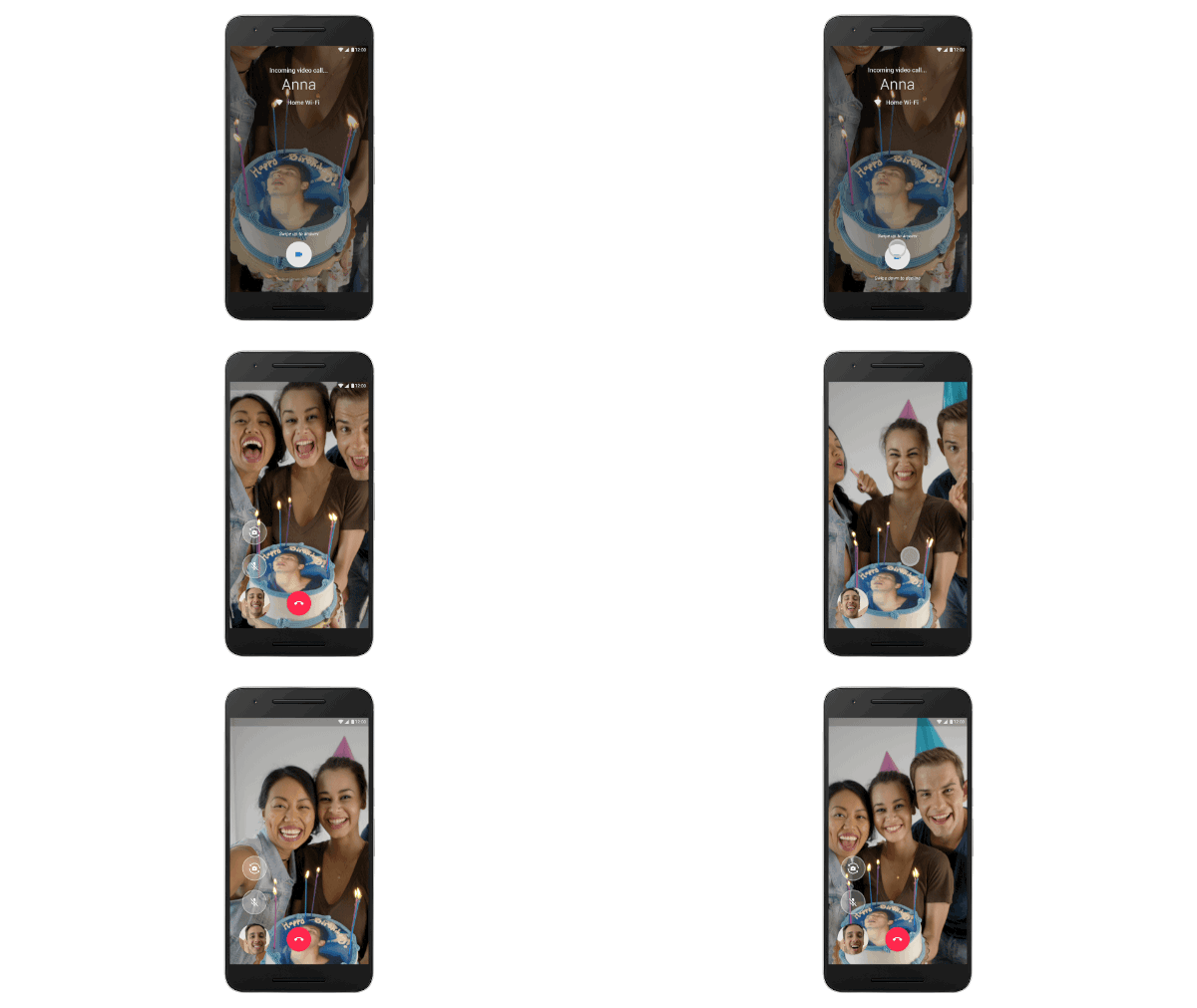
Perhaps the most clever feature Google included is Knock Knock. If you’re using an Android phone and someone calls, you’ll see a preview of their video feed on the lock screen. The person calling can wave or gesture or make a silly face to try and draw you into the conversation, and Fox says that makes the person on the receiving end a lot more likely to answer with a smile rather than a look of confusion as they wonder if they video is working properly. For the sake of privacy, you’ll only see a video feed from people in your contacts list, and you can turn the feature off entirely if you prefer.
It’s all part of Google’s goal to make the app not just simple but “human” as well. “It’s something that you don’t generally hear from Google when we talk about our apps,” Fox admits, “but video calling is a very human experience, so it’s very important that you feel that in the app as well.”

All of this adds up to a product that is refreshingly uncluttered and has a clear sense of purpose. It doesn’t fundamentally change the video-calling experience, but it is frictionless and very easy to use on a moment’s notice. Under the hood, the app does live up to its promise of updating the call based on changing network conditions — you can even flip between WiFi and cellular networks without dropping a call. There’s not a whole lot to say about the experience, and that’s probably for the best. You can make calls to people in your contacts list easily, not worry too much about dropping them, and then get on with your life.
That ease of use is what Google hopes will pull users into the app. It does indeed feel simpler than most other options out there. But given the huge variety of communication apps available and Google’s strange historical difficulty with the space, it’s not hard to imagine Duo being a niche app. That won’t be for lack of effort — Duo actually does make video chat easier than making a phone call.

![[Video] Discover Your Ideal Bespoke AI Laundry Appliance](https://loginby.com/itnews/wp-content/uploads/2026/04/Video-Discover-Your-Ideal-Bespoke-AI-Laundry-Appliance-238x178.jpg)
![[Video] Everyday Freedom, Hands-Free With the Galaxy Buds4](https://loginby.com/itnews/wp-content/uploads/2026/03/Video-Everyday-Freedom-Hands-Free-With-the-Galaxy-Buds4-238x178.jpg)


![[Interview] How Jacob Kiplimo’s Galaxy Watch Turns Data Into](https://loginby.com/itnews/wp-content/uploads/2026/04/1776021792_Interview-How-Jacob-Kiplimo’s-Galaxy-Watch-Turns-Data-Into-100x75.jpg)

