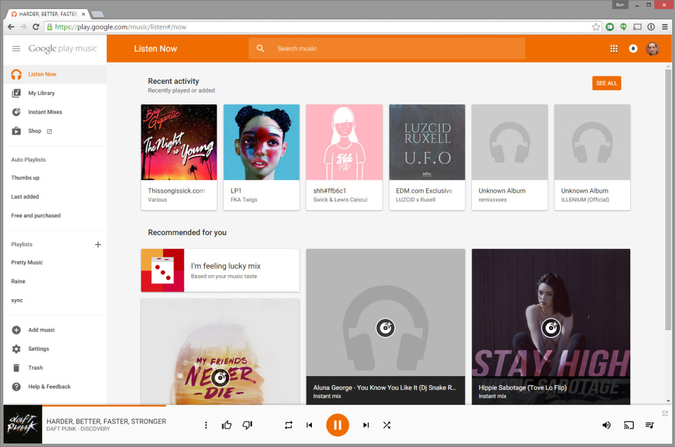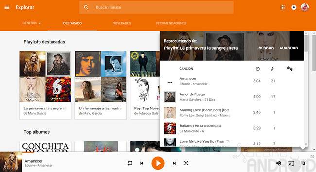
The new Google Play Music design. The biggest difference on the main page is a bright orange header.
17 more images in gallery
Today Google is launching a redesign of the Google Play Music website, it’s browser-based companion to the Android and iOS apps. The new design looks a lot like the mobile apps, with a bright orange header, collapsible sidebar, and full-width background images for some pages.
The interface was rewritten in Polymer, Google’s UI toolkit for the web that aims to bring an app-like experience to the web. In an interview with The Verge, Google UX designer Bryan Rea stated “We’re moving towards making the web feel more like an app and less like a series of web pages strung together by links. The new header, the slick transition as you scroll, the collapsible nav, new animations, these all feel like things you expect in an app not on the Web.”
When we noted that Polymer version 1.0 was launching at Google I/O, we wondered if the toolkit was the secret sauce holding back Google’s promised Material Design overhaul of all its web properties. It’s looking more and more likely that that is the case, and that we’re about to see a flood of Google website updates. Google’s Product Forums also got a Material redesign today, and the Google Translate Community page was updated a few days ago.
Read 2 remaining paragraphs | Comments
![]()


