Andrew Cunningham
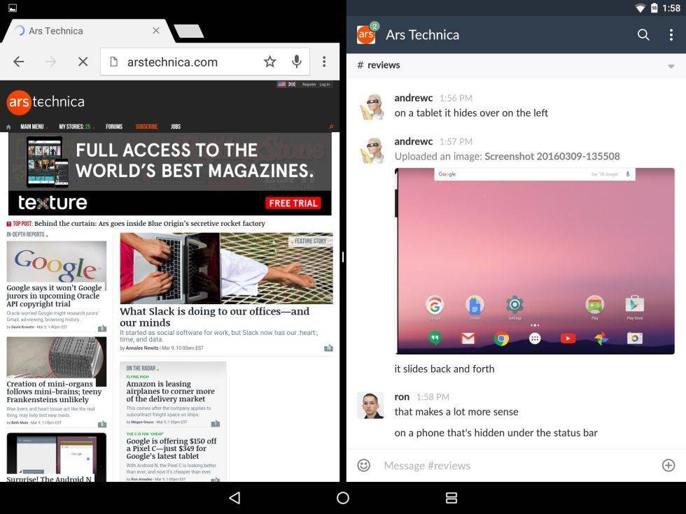
Here’s Android N’s multi-window mode on a Nexus 9 running the first Android N preview. Note how the normally square recent apps navigation button turns into two rectangles in multi-window mode.
12 more images in gallery
Google has dropped an early version of the Android N preview months before Google I/O, which is when we first saw the Android M preview build last year. Developer images for most recent Nexus devices went up on Google’s site today, and we’ve already got them running on some phones and tablets and we’re digging in.
The most significant new feature, at least if you’re still holding out hope for Android tablets, is a multi-window multitasking mode not unlike the ones in iOS 9, Samsung’s version of Android, or Windows 8 and 10. It’s come a long way since we saw the janky, hidden, mostly broken version of it included in early Marshmallow previews. It’s about as buggy and crash-prone as you’d expect from an early build of an upcoming OS, but underneath those bugs is a multitasking UI that’s actually pretty elegant, and it offers some nice improvements over the Split View mode introduced in iOS 9.
Understanding the basics
Android is iOS-like in that it seems to designate a “primary” and “secondary” app—we’ll use these terms to specify which app we’re talking about during this explainer. The primary app, chosen when you turn on multitasking mode, is on the left or the top half of the screen and is more-or-less pinned to that section of the screen. The secondary app, selected from the Recent Apps list or home screen once you’ve fired up multitasking mode, is on the right side of the screen and is easily switchable.
Read 11 remaining paragraphs | Comments
![]()


